 Jessica

Design school teaches the three-layer lighting model — ambient, task, accent — and most interior design content for US homeowners repeats it faithfully. It’s a useful framework. It’s also incomplete in ways that explain why so many rooms have technically correct lighting that still doesn’t feel right.
The rules that actually determine whether a room’s lighting succeeds or fails are more specific than the three-layer model suggests — and most of them never make it into mainstream design content because they require understanding not just what lighting categories exist but how the human visual system actually responds to different lighting conditions. Professional lighting designers know these rules. Architects who specialize in residential design know them. The homeowners paying for the result almost never do.
This article covers the specific lighting principles that produce exceptional results in residential spaces — the rules about fixture placement, contrast ratios, color rendering, vertical illumination, and lighting psychology that separate rooms that feel genuinely well-lit from ones that just have enough fixtures. Some of these will contradict what you’ve been told. Most will explain something about a lighting situation in your own home that has never made sense before.
Rule 1: The Contrast Ratio Matters More Than Brightness
Most US homeowners think about lighting in terms of brightness — whether a room is bright enough to see comfortably. Professional lighting designers think about contrast ratios — the relationship between the brightest and darkest areas of a space.
The human visual system interprets high-contrast environments (bright areas surrounded by darkness) as intimate, dramatic, and warm. It interprets low-contrast environments (even illumination throughout) as functional, institutional, and cold. This explains why candlelit restaurants feel romantic and fluorescent-lit cafeterias do not, despite the cafeteria being significantly brighter.
In residential lighting, the practical implication is counterintuitive: making a room feel warmer and more welcoming often means reducing brightness in some areas rather than increasing it overall. A room with one warm lamp creating a pool of light in a corner reads as more inviting than the same room with every surface evenly illuminated at higher brightness.
| Contrast Ratio | Atmospheric Effect | Typical Application |
|---|---|---|
| Very high (1 bright source, dark surround) | Dramatic, theatrical, intimate | Accent lighting, restaurant atmosphere |
| High (several distinct pools, dim background) | Warm, residential, inviting | Evening living room, bedroom |
| Medium (layered sources, varied intensity) | Comfortable, functional-warm | Well-designed residential standard |
| Low (even illumination throughout) | Functional, institutional, cold | Office lighting, commercial spaces |
| Very low (uniform bright everywhere) | Clinical, flat, uncomfortable for evening use | Hospital, retail — not residential |
Rule 2: Vertical Surfaces Need Lighting More Than Horizontal Ones
Standard lighting practice illuminates horizontal surfaces — the floor, countertops, tabletops. Professional lighting designers know that illuminating vertical surfaces — walls — does more for how a room feels than anything done at floor or counter level.
When walls are lit, the perceived volume of a space increases. The room feels larger because the eye can fully register its boundaries. When walls are dark and floors are lit, the room feels smaller — the eye’s field registers the illuminated floor as the extent of the space.
Wall washing — a technique where light sources graze vertical surfaces to illuminate them — is one of the most powerful and least-used lighting tools available to US homeowners. It doesn’t require specialized equipment. A floor lamp positioned close to a wall and directed upward, a wall sconce, or a picture light on artwork all contribute wall illumination that changes how the entire room reads spatially.
Rule 3: The 30-Degree Rule for Accent Lighting
When lighting a specific object — artwork, a sculpture, a significant piece of furniture — the angle of the light source relative to the object determines whether the lighting enhances or flattens the object.
Lighting aimed directly at an object (90 degrees, straight on) eliminates shadow and makes the object look flat. Lighting at approximately 30 degrees off vertical creates shadow that reveals texture, depth, and three-dimensionality. This is why museum lighting consistently makes artwork look more impressive than the same artwork in a home — museums apply the 30-degree rule precisely and most homes don’t apply it at all.
The practical implication: a directional light source — a track light, a picture light, a table lamp positioned off to one side — illuminates objects more effectively than an overhead source directly above them.
| Lighting Angle | Effect on Object | Best For |
|---|---|---|
| 90° (directly above or straight on) | Flat, shadowless, two-dimensional | Product photography — not art display |
| 45° | Some modeling, moderate depth | General accent lighting |
| 30° (professional standard) | Maximum texture and depth revelation | Artwork, sculpture, textured surfaces |
| 15° (grazing light) | Extreme texture emphasis | Stone walls, brick, textured surfaces |
Rule 4: Color Rendering Index Is More Important Than Color Temperature
Most homeowners know about color temperature (the warm-to-cool spectrum measured in Kelvin). Far fewer know about the Color Rendering Index (CRI) — a measure of how accurately a light source renders colors compared to natural sunlight.
CRI is measured on a scale of 0 to 100. Natural sunlight is 100. Standard LED bulbs commonly sold in US hardware stores often have CRI values of 80 to 85. High-CRI bulbs (90+) render colors significantly more accurately — which means paint colors look like they should, food looks more appealing, and skin tones look healthy rather than washed out.
The cost difference between standard and high-CRI bulbs is minimal — typically $1 to $3 per bulb. The difference in how everything lit by them looks is significant enough that professional photographers and cinematographers won’t use bulbs below CRI 95 for any application where color accuracy matters.
| CRI Range | Color Rendering | Recommended Use | Typical Cost Premium |
|---|---|---|---|
| 80–85 | Acceptable — most standard LEDs | Utility spaces, closets | Baseline |
| 90–95 | Very good — residential standard | All living and sleeping spaces | +$1–$2 per bulb |
| 95–100 | Excellent — professional grade | Kitchen task areas, bathrooms, studios | +$2–$4 per bulb |
| Below 80 | Poor — colors shift significantly | Never in rooms where appearance matters | Lower cost, higher appearance cost |
Rule 5: The Fixture Height Rule That Most People Get Wrong
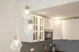
There’s a widely shared rule that pendant lights over dining tables should hang 30 to 36 inches above the table surface. This rule is correct for standard ceiling heights of 8 feet but fails to account for ceiling height variation — and US homes range from 8-foot builder standard to 12-foot ceilings in older construction.
The professional approach: for every additional foot of ceiling height above 8 feet, raise the pendant 3 inches. A 9-foot ceiling needs pendants at 33 to 39 inches above the table. A 10-foot ceiling needs pendants at 36 to 42 inches. A 12-foot ceiling may warrant a pendant as high as 48 inches above the table surface.
Ignoring ceiling height in fixture placement produces the most common lighting installation error in US renovations: pendants that hang at the right abstract height but the wrong actual height for the space they’re in.
Rule 6: Lighting Psychology — What the Brain Interprets as “Expensive”
There’s a documented relationship between lighting characteristics and perceived quality that interior designers use deliberately. The human brain interprets certain lighting conditions as high-quality environments — not because it’s been taught to but because those conditions appear in spaces that are actually well-made and well-maintained.
The specific conditions that read as high quality: warm color temperature (2700K to 3000K), varied intensity with distinct bright and dim zones, high CRI that makes colors look accurate and rich, fixtures that are visually significant rather than invisible, and the absence of visible glare from exposed bulb sources.
The inverse conditions read as low quality: cool color temperature, even brightness throughout, low CRI that makes colors look shifted, fixtures that are purely functional, and exposed light sources that create glare.
| Lighting Characteristic | Brain Interpretation | Cost to Change |
|---|---|---|
| Warm color temperature (2700K) | Quality, care, luxury | $15–$40 (bulb replacement) |
| Varied intensity (dimming) | Sophistication, intentionality | $15–$40 per dimmer switch |
| High CRI (90+) | Clarity, richness, accuracy | $1–$3 per bulb premium |
| Visually significant fixtures | Design investment, permanence | $80–$400 per fixture |
| No visible glare | Comfort, quality control | Shades, diffusers, positioning |
| Multiple source heights | Depth, complexity, warmth | $45–$150 per added lamp |
Frequently Asked Questions
What is the most important lighting rule that most US homeowners don’t know?
The contrast ratio rule — that making some areas darker while brightening others creates more warmth and invitation than uniformly brightening a room. Most homeowners try to fix dim, flat rooms by adding brightness. Professional lighting designers fix them by adding contrast: a brighter zone here, a darker zone there, pools of light rather than even illumination.
What is CRI and why does it matter for home lighting?
CRI is the Color Rendering Index — a measure of how accurately a bulb renders colors compared to natural sunlight. Bulbs below 90 CRI make colors look shifted: paint colors look different from the chip, food looks less appealing, skin tones look unnatural. High-CRI bulbs (90+) make everything they illuminate look more accurate and richer. The cost premium is $1 to $3 per bulb and the improvement is visible immediately.
Why does museum lighting make art look so much better than home lighting does?
Two reasons: the 30-degree angle rule (lighting at an angle that creates shadow and reveals depth) and high CRI (ensuring colors render accurately). Museum lighting designers apply both principles precisely. Most home lighting illuminates art from directly above or straight on at low CRI — which flattens the subject and shifts its colors simultaneously. Repositioning a light source to hit art at approximately 30 degrees off vertical, with a high-CRI bulb, produces a transformation that most homeowners find dramatic.
How do I calculate the right height for pendant lights over my dining table?
Start with 30 to 36 inches above the table surface for standard 8-foot ceilings. Add 3 inches for every foot of ceiling height above 8 feet. In a room with 10-foot ceilings, that means 36 to 42 inches above the table. The lower end of the range works better for small fixtures; the upper end for larger, more dramatic ones. Visual confirmation is the final check — seated at the table, the pendant should not block sightlines across the table.
What’s the cheapest lighting change that produces the most improvement?
Replacing standard CRI bulbs (80–85) with high-CRI alternatives (90+) at 2700K color temperature throughout living spaces. The total cost for most US homes is $30 to $60 in bulbs. The improvement in how paint colors read, how materials look, and how comfortable the spaces feel is immediate and requires no other change. It’s consistently the highest-return-per-dollar lighting intervention available.
The Bottom Line
The lighting rules that produce exceptional results in residential spaces are more specific than the three-layer model suggests — and knowing them explains why some rooms with technically adequate lighting still don’t feel right while others with modest budgets feel genuinely well-designed.
Contrast ratio over brightness. Vertical surfaces as much as horizontal. The 30-degree angle for accent lighting. CRI as important as color temperature. Fixture height adjusted for ceiling height. Lighting characteristics that the brain interprets as quality.
These are the rules professional lighting designers apply as a matter of course. They’re learnable, most of them are achievable without electrical work, and applying them to an existing setup consistently produces better results than adding more fixtures to a lighting approach that’s already getting the fundamentals wrong.
For lighting rules must visit https://designmode24.co/