
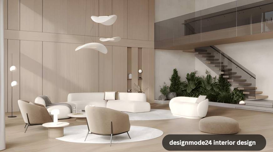
Walk into a room that feels right and you usually can’t say why. The furniture isn’t unusual. The colors aren’t loud. Nothing about it screams “designed.” That’s not an accident, and it’s not luck either. It’s a ratio.
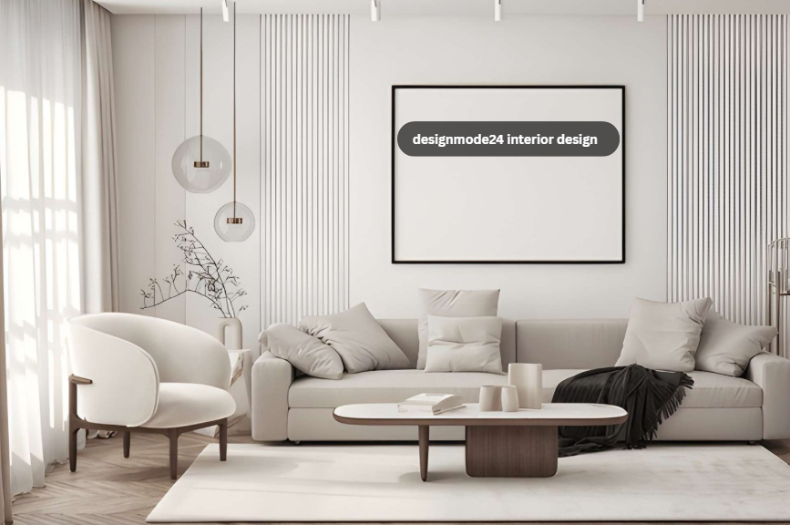
At designmode24 interior design, almost every layout we build starts with one working rule: 70% of a room has to earn its keep, and 30% gets to just look good. The practical 70% covers walking paths, seating that actually gets sat in, storage that holds real things. The decorative 30% is where we spend the personality budget: a sculptural lamp, a textured throw, art that doesn’t match the couch on purpose. Skip this split and you end up with one of two problems. A showroom nobody wants to live in. Or a cluttered room that never feels finished, no matter how much you spend on it.
This article breaks down how designmode24 interior design applies the 70/30 rule room by room, why it tends to outlast trend-chasing approaches, and what it actually looks like in the rooms our clients keep coming back to redo with us. We’ll also cover the materials and layout habits that show up again and again once you start looking for them: asymmetry, natural textures, smart entryway storage.
What Is the 70/30 Rule in DesignMode24 Interior Design?
The 70/30 rule splits a room’s design budget, meaning space, money, and visual attention, between function and decoration. Seventy percent goes to the bones: traffic flow, durable furniture, lighting you can actually read by. Thirty percent goes to the things that make a room feel like yours: art, textiles, the odd object that has no job except looking interesting.
It’s not a strict measurement you’d verify with a tape measure. It’s a discipline. Before adding anything decorative, designmode24 interior design asks whether the functional 70% is solved first. A coffee table that’s too small for the sofa, or a hallway runner that narrows a doorway, breaks the rule even if the room looks pretty in photos.
| Room Zone | Functional 70% | Decorative 30% |
| Living room | Sofa sized to the room, clear walking lanes, task lighting | Art, throw pillows, accent objects |
| Entryway | Shoe storage, a place to set down keys and mail, durable flooring | Mirror, console styling, a single statement piece |
| Bedroom | Bed placement, nightstand reach, closet access | Headboard texture, layered linens, wall art |
| Kitchen | Work triangle, storage depth, counter clearance | Open shelving display, pendant lighting style, hardware finish |
How DesignMode24 Applies Material Choices to the 70% Side of a Room
Materials are part of the functional layer, not just the decorative one, and that’s a distinction a lot of design advice skips. This is one of the clearest places where designmode24 interior design differs from generic décor advice. A solid oak console will outlast three trend cycles. Black walnut darkens with age instead of looking dated. Brushed metal hides fingerprints better than polished chrome, which matters in a kitchen with kids or a front-facing console everyone touches walking by.
design designmode24 leans on a short list of materials for this reason: they’re chosen for how they wear, not just how they photograph. A linen sofa that pills after a year isn’t a functional win even if it looked perfect in the showroom.
| Material | Why It’s in the 70% | Common Use |
| Solid oak | Resists warping, ages well, structurally sound for daily use | Consoles, dining tables, shelving |
| Black walnut | Hides minor scuffs, deepens in color over time | Statement furniture, accent cabinetry |
| Brushed metal | Fingerprint-resistant, durable finish | Hardware, light fixtures, table legs |
| Performance fabric | Stain-resistant, holds up to daily seating use | Sofas, dining chairs |
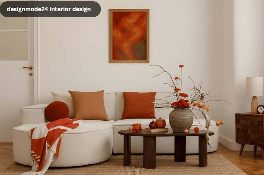
Why Asymmetry Works Better Than Matching Sets
Perfectly matched furniture sets are easy to buy and hard to live with. They read as staged the moment you walk in, because real homes accumulate things unevenly over time. interior design designmode24 deliberately breaks symmetry on purpose: a pair of mismatched nightstands, an upholstered headboard against a hard wood floor, a wool rug under a glass table.
The trick is that asymmetry still needs balance. Just not matching balance. A heavy wood dresser on one side of a room needs something visually substantial (not identical) on the other, whether that’s a tall plant, a mirror, or a stack of books. This is where the 30% decorative budget does its real work: making contrast feel intentional rather than random.
Applying the Rule to Smart Home and Entryway Layouts
Two areas trip people up the most: hiding tech without losing function, and keeping entryways from becoming a dumping ground.
For smart home integration, the 70% is wire management and device placement that doesn’t fight the room’s sightlines. Speakers tucked into shelving. Charging stations built into a console drawer instead of sitting exposed on a counter. The 30% is whatever finish ties it back into the room, like a fabric speaker cover that matches the upholstery.
For entryways, function means a place for shoes, a spot for mail and keys, and flooring that handles wet boots in January. Once that’s solid, a single styled piece (a console chest, a mirror, a small bench) covers the remaining 30% without turning the entry into clutter.
Frequently Asked Questions
What is the 70/30 rule in interior design?
It allocates roughly 70% of a room’s space and effort to function (traffic flow, durable furniture, storage) and 30% to decoration (art, textiles, accent pieces). The goal is a room that stays livable even after the photos stop looking new.
Does designmode24 design only work for large homes?
No, the ratio just scales down. A small apartment entryway still needs its functional layer solved first, shoe storage and a spot to drop keys, before any decorative piece goes in. Smaller rooms have less room for error if that order gets reversed.
How is www. designmode24. com different from a typical décor blog?
Most décor content treats function and style as one decision made at the same time. We treat them as two separate budgets, solved in order: function first, then decoration. That sequencing is the whole approach.
Getting Started
If you’re staring at a room that looks fine on paper but never feels settled, it’s usually a 70/30 problem in disguise: too much decoration covering for furniture that doesn’t fit the space, or too much function with nothing to make the room feel lived-in. That’s the gap designmode24 interior design exists to close. To contact designmode24 about a room, a full home, or a commercial space, reach out through our site and tell us which side of the ratio is giving you trouble. That’s usually all it takes to know where to start.
