 Jessica
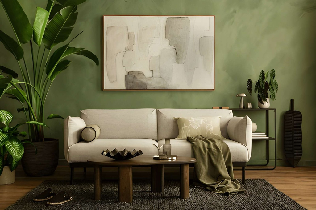
Walk into any room that feels genuinely finished and there’s almost always artwork on the walls. Not as decoration that was added last — as something that was considered from the beginning, chosen deliberately, and placed with intention. Remove it and the room loses something hard to name but immediately felt.
Most homeowners get this part wrong. They buy artwork they like in isolation, hang it at the wrong height, choose a size that disappears against the wall, or pick pieces that fight the room’s existing palette rather than working with it. The result is a space that looks assembled rather than designed.
Choosing artwork that actually works with your interior isn’t about having expensive taste or an art history degree. It’s about understanding a handful of practical principles — scale, color relationship, subject matter, and placement — and applying them before you buy anything. This article walks through all of it: how to read your room before you shop, what to look for in a piece, how to hang it correctly, and the mistakes that trip up most US homeowners. By the end, you’ll have a clear framework for making decisions you’ll still be happy with five years from now.
Why Artwork Is One of the Most Important Decisions in a Room
Most people treat artwork as a finishing touch — something you add after everything else is settled. That’s backwards. A strong piece of artwork can anchor a room’s entire color palette, establish its mood, and give every other element something to respond to.
The rooms that feel most cohesive — the ones that read as design rather than decorated — almost always have artwork that was part of the plan, not an afterthought. That’s the shift worth making.
| Role Artwork Plays | How It Affects the Room |
| Anchors a color palette | Pulls colors from the piece into textiles and accessories |
| Establishes scale | A large piece makes a room feel intentional and grounded |
| Creates a focal point | Directs the eye, organizes the visual hierarchy |
| Adds texture and depth | Especially true of originals, prints with visible texture |
| Reflects personality | The one element that’s harder to get generic |
How to Choose Artwork That Fits Your Space
Start With the Room, Not the Gallery
Before buying anything, look at what you already have. What colors are in your rug, cushions, or upholstery? What’s the dominant tone of your walls? What mood does the room currently have — warm and relaxed, or clean and minimal?
Good artwork doesn’t need to match your sofa. It needs to be in conversation with the room. A piece that pulls one color from your existing palette — even a secondary tone — will feel intentional. One that introduces an entirely new color family will feel like it wandered in from somewhere else.
Get the Scale Right Before Anything Else
Scale is where most people go wrong first. Artwork that’s too small for a wall reads as an afterthought. As a general rule, a single piece above a sofa should be roughly two-thirds the width of the sofa — not centered on a tiny hook and surrounded by empty wall.
| Wall or Furniture | Recommended Artwork Width |
| Standard sofa (84″) | 54–60″ wide piece or gallery grouping |
| Queen/King bed headboard | 60–70% of headboard width |
| Dining room wall | Large single piece or salon-style gallery |
| Narrow hallway | Vertical format, 12–18″ wide max |
| Fireplace mantel | Slightly wider than the mantel opening |
For gallery walls, the grouping as a whole should follow the same proportion rules as a single piece. Treat the collection as one unit when measuring.
Color Relationship: Three Approaches That Work
There’s no single correct way to relate artwork to a room’s palette, but three approaches consistently work:
Pull from existing color. Choose artwork that contains at least one color already present in the room. This creates visual continuity without forcing a match.
Contrast intentionally. A neutral room — whites, beiges, warm greys — can handle a bold piece without it feeling jarring. The contrast becomes the point.
Go tonal. Artwork in the same color family as the walls (a warm landscape in a terracotta room, a blue abstract in a navy space) creates a layered, sophisticated effect that’s harder to pull off but rewarding when it works.
Hanging Artwork: The Mistakes That Undermine Good Choices
Even well-chosen artwork fails when it’s hung incorrectly. The most common error in US homes is hanging pieces too high. The center of any artwork — or gallery grouping — should sit at approximately 57–60 inches from the floor. That’s standard gallery height, and it’s lower than most people’s instinct.
A good starting point for interior design decisions around placement: if you have to tilt your chin up to look at it comfortably, it’s too high.
| Common Hanging Mistake | What to Do Instead |
| Too high on the wall | Center at 57–60″ from floor |
| Too small for the space | Go larger or create a grouped arrangement |
| Hung in isolation above furniture | Keep 6–8″ gap between furniture and bottom of piece |
| Inconsistent spacing in gallery walls | Use 2–3″ between frames throughout |
| Ignoring lighting | Add picture light or aim a track light at the piece |
Choosing Artwork by Room: Quick Reference
| Room | What Works | What to Avoid |
| Living room | Large anchor piece, abstract or landscape | Small pieces that get lost on big walls |
| Bedroom | Calm subject matter, warm tones | High-contrast or visually busy pieces |
| Dining room | Bold statement piece, portrait orientation | Anything too small for the wall scale |
| Home office | Motivating or minimal pieces | Overly decorative or distracting work |
| Hallway | Vertical formats, series or collections | Oversized horizontal pieces |
Frequently Asked Questions
How do I know if artwork is the right size for my wall?
Cut kraft paper to the dimensions of the piece you’re considering and tape it to the wall. Live with it for a day. If it looks small in the space, go larger. Most people underestimate how big artwork needs to be to read properly on a wall.
Does artwork have to match my furniture or decor style?
No. Artwork doesn’t need to match — it needs to work. A contemporary abstract in a traditional room creates interesting tension. A classical figure in a minimal space adds warmth and history. The key is intentionality, not stylistic consistency.
How many pieces of artwork should I have in one room?
There’s no set number. One strong piece can be enough. A gallery wall of fifteen can work if it’s well-composed. The question isn’t quantity — it’s whether each piece is earning its place on the wall.
Is original artwork worth it over prints?
For most US homeowners, high-quality prints — particularly from independent artists on platforms like Society6 or Saatchi Art — offer excellent value. Original work has texture and presence that prints can’t fully replicate, but a well-chosen print beats a mediocre original every time. The piece matters more than the format. Thoughtful interior design decisions treat prints as fully legitimate options, not consolation choices.
What’s the best way to find artwork that suits my style?
Start by saving images of rooms you love and looking at what the artwork has in common — subject matter, palette, scale, level of abstraction. Your taste is already there. You just need to identify the pattern before you shop.
The Bottom Line
Artwork is one of the few elements in a room that carries both visual and emotional weight simultaneously. Get it right and everything else settles into place around it. Get it wrong and even a well-furnished room feels incomplete.
The framework is straightforward: read the room before you shop, prioritize scale over style, relate color deliberately, and hang at the right height. Those four decisions separate artwork that works from artwork that sits on a wall waiting to be replaced. Furthermore, You can contact us at https://designmode24.co for more ideas.